

From Empty Spaces to Engaging Experiences: The Magic of a Reusable Illustration Component
Why your Salesforce solution needs it & where you can get one


Have you ever opened a page or component, eagerly anticipating to see something, only to be greeted by a vast empty space? I am sure you felt as clueless as a penguin trying to fly. Well, that is where illustrations come to the rescue.
🖼️ What's an Illustration?
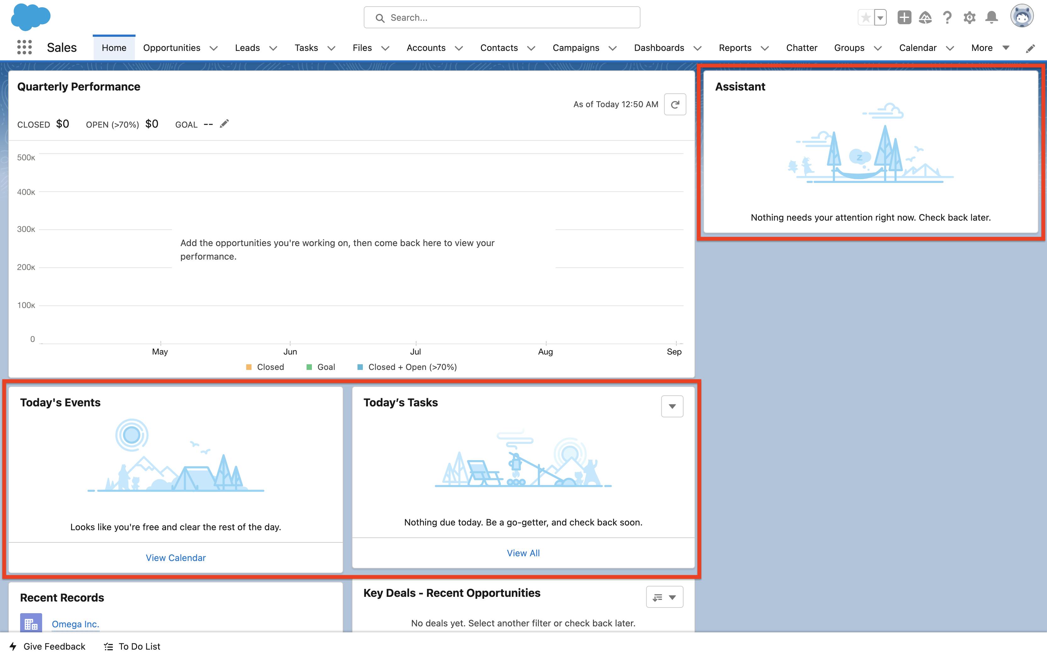
An illustration is an image and inline text that work in tandem to communicate the state of a component in a more friendly way. If you have used Salesforce, you must have seen them show up across your org.

🤔 Why should you use Illustrations?
When your user expects to see something but doesn't see any, the experience leaves a negative impression — illustrations help reduce this.
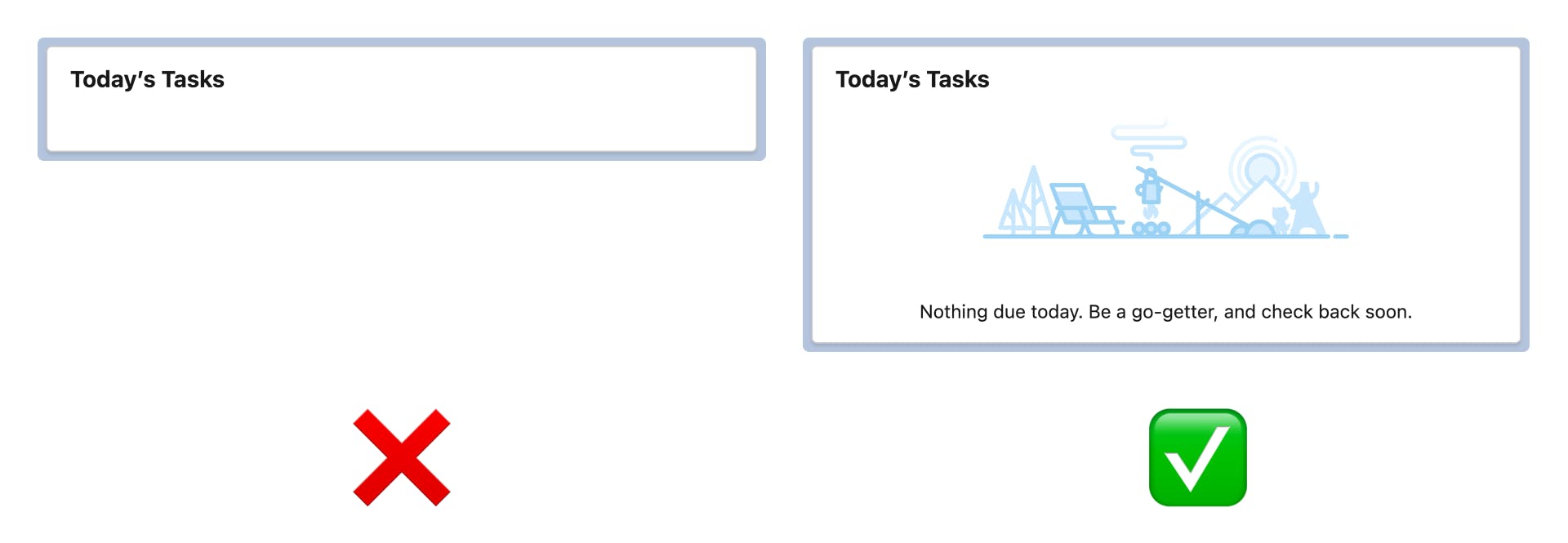
Usually, a lot of custom solutions show an empty whitespace when there is nothing to show in their components. This is called the Empty State. Like the one below:

It leaves the user in a confused state because the whitespace can be interpreted in many ways. Does the whitespace mean:
The component loaded successfully but there is no data to show? or
Is there an error and the component couldn't load completely? or
Is there data to show but the component errored out before it could successfully show the data? Or
Is it something else 🤔
You see, communicating the state of your component to the user is very important because, it:
Provides clarity in a user-friendly way, leaving no room for assumptions
Makes your solution visually appealing
Adds energy & delights your user
Saves your users’ time & energy
That is why most of the standard out-of-the-box components use Illustrations to communicate the state of the component.
Read more about Empty State & Illustration - https://www.lightningdesignsystem.com/guidelines/empty-state/
Now that we have a compelling reason to use Illustrations. How do you use them on your custom LWC Components?
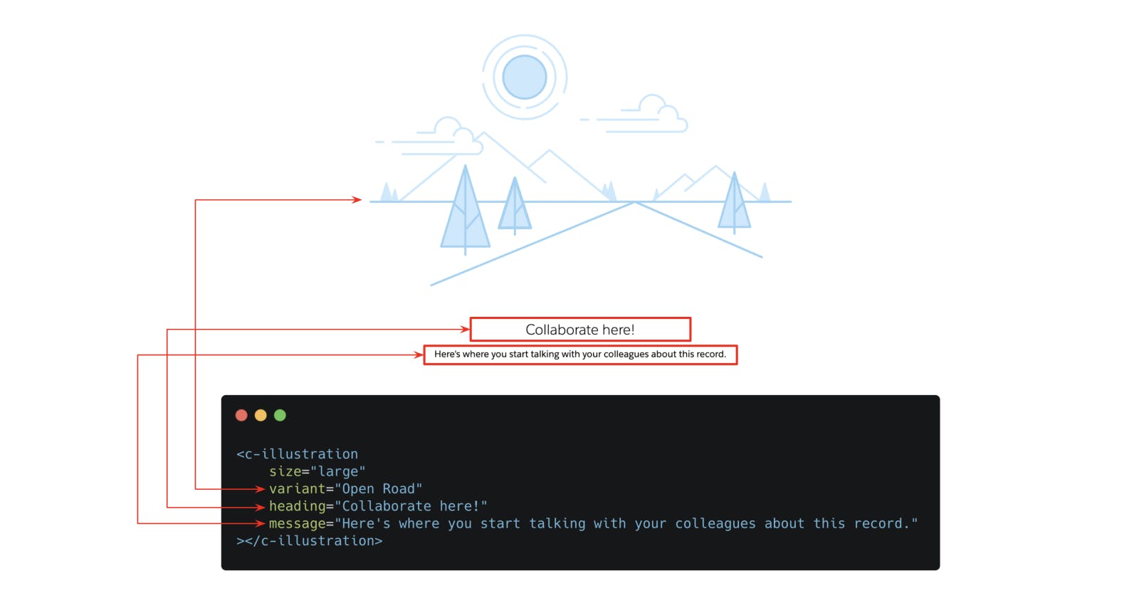
⚒️ How to add Illustrations in LWC Components?
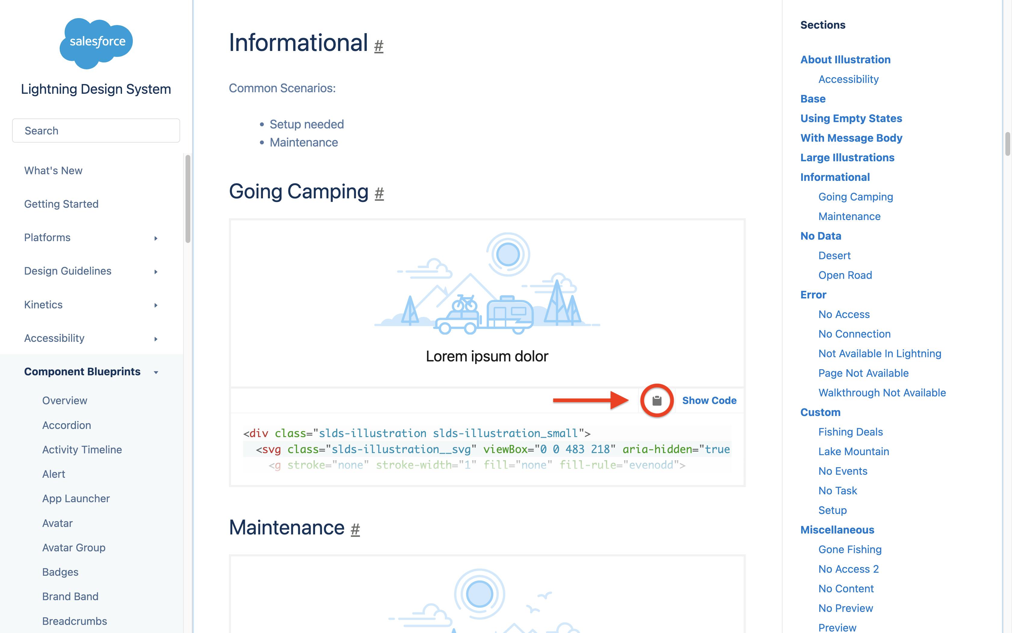
Go to the Illustrations page on the Lightning Design System website
Choose any illustration from the list
Click on the clipboard icon 📋 to copy the code to your clipboard
Paste it in your LWC within the
<template> </template>TagsSave & Done
🧐 Why do you need a reusable component?
Imagine copying and pasting the same illustration code into multiple components across your org. That will lead to code duplication, and redundancy and makes it hard to maintain.
📦 How do you create one?
Fortunately, we don't have to build one from scratch because they have already been built by some of the trailblazers in the community. Check'em out!
https://github.com/kacrouse/lwc-illustration by Kyle Crouse
Here's to a step closer to building delightful customer experiences 🥂