Radio Toggle Button Group with Icons in Lightning Web Components (LWC)
Use Case
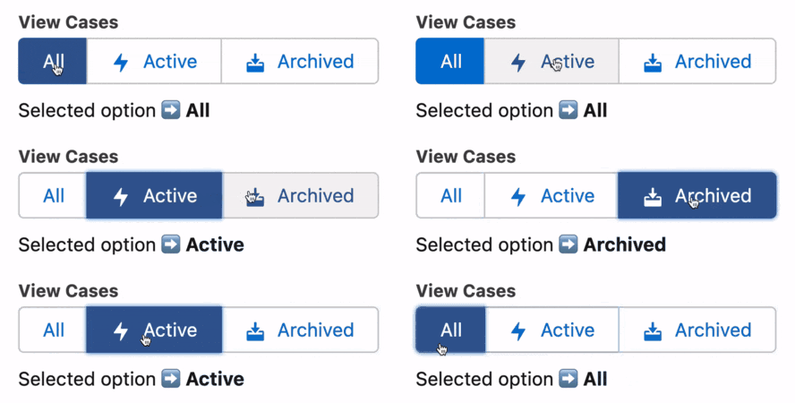
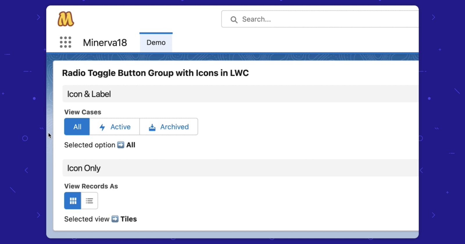
Recently we were building a component that shows a list of records, let’s say Cases. One of its important features is the user should be able to toggle the list view to show All cases, only Active cases, or only Archived cases and the user should know what they are viewing currently.
First thought – Radio Button Group is a great fit for this solution.

We also needed to add icons along with the button labels so the toggles can be identified easily.

But the lightning-radio-group component doesn’t support icons. So how do we do it?
lightning-button-group for the win
It has the same look and feel as the lightning-radio-group component plus it supports icons for each button, which is exactly what we need. The only thing missing from it is the interactivity part – when a user clicks on an option, the selected option gets a blue background denoting that it is selected. So let’s build that.
Variant 1 – Icon & Label

toggleButtonWithIcons.html
<template>
    <fieldset class="slds-form-element">
        <legend class="slds-form-element__legend slds-form-element__label">View Cases</legend>
        <div class="slds-form-element__control">
            <lightning-button-group lwc:ref="dataViewBtnGrp">
                <lightning-button label="All" data-value="All" variant="brand"
                                  onclick={handleSourceChange}>
                </lightning-button>
                <lightning-button label="Active" data-value="Active" icon-name=utility:fallback
                                  onclick={handleSourceChange}>
                </lightning-button>
                <lightning-button label="Archived" data-value="Archived" icon-name="utility:package"
                                  onclick={handleSourceChange}>
                </lightning-button>
            </lightning-button-group>
        </div>
    </fieldset>

    <div class="slds-m-top_x-small"> Selected option  <strong>{selectedOption}</strong></div>
</template>
toggleButtonWithIcons.js
import { LightningElement } from 'lwc';
export default class ToggleButtonWithIcons extends LightningElement {

    selectedOption = 'All';

    handleSourceChange(event) {
        let clickedButton = event.currentTarget;
        let allButtonsInGrp = this.refs.dataViewBtnGrp.children;
        for (let btn of allButtonsInGrp) {
            btn.variant = 'neutral';
        }
        clickedButton.variant = 'brand';
        this.selectedOption = clickedButton.dataset.value;
    }

}
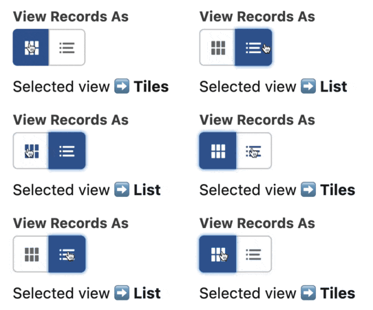
Variant 2 – Icon Only

toggleButtonWithIcons.html
<template>
    <fieldset class="slds-form-element">
        <legend class="slds-form-element__legend slds-form-element__label">View Records As</legend>
        <div class="slds-form-element__control">
            <lightning-button-group lwc:ref="viewSwitchBtnGrp">
                <lightning-button-icon icon-name="utility:tile_card_list" variant="brand"
                                       onclick={handleViewSwitchButton} alternative-text="Tile View" title="Tile View"
                                       data-value="Tiles">
                </lightning-button-icon>
                <lightning-button-icon icon-name="utility:richtextbulletedlist"
                                       onclick={handleViewSwitchButton} alternative-text="List View" title="List View"
                                       data-value="List">
                </lightning-button-icon>
            </lightning-button-group>
        </div>
    </fieldset>

    <div class="slds-m-top_x-small"> Selected view  <strong>{selectedView}</strong></div>
</template>
toggleButtonWithIcons.js
import { LightningElement } from 'lwc';
export default class ToggleButtonWithIcons extends LightningElement {

    selectedView = 'Tiles';

    handleViewSwitchButton(event) {
        let clickedButton = event.currentTarget;
        let allButtonsInGrp = this.refs.viewSwitchBtnGrp.children;
        for (let btn of allButtonsInGrp) {
            btn.variant = 'neutral';
        }
        clickedButton.variant = 'brand';
        this.selectedView = clickedButton.dataset.value;
    }

}
Resources
Components
Button Group – LWC Base Component | SLDS Blueprint
Radio Group – LWC Base Component | SLDS Blueprint
Happy Toggling!

